1) put these headings: Rainfall, Temp, in , B3, C3:
2) put the months in A4-A15, average rainfall in B4-B15, and average temps in C4-C15
3) select the data from A3 to C15
4) Select 2 Line Graph (gráfico de líneas)
5) Click on the rainfall line, then press the right mouse button, change type of graph: choose columns
6)Once you are on the red line, press the right mouse button, choose data format ("formato serie datos"). Go to axis ("eje"), choose secondary axis
7) The primary axis has to double the value of the secondary axis. So click on the rainfall axis (right button), select scale and then data: write maximum value (400), minimum value (0), the biggest figure- unidad mayor (20). Do the same with the temperature axis, but with different values: maximum value (200), minimun value (0), the biggest figure (10)
8) To put the title, click on a blank top area (right button), select legend format ("formato de leyenda") and legend options, click on superior. Finally write the title.
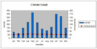
DATA: SRI LANKA

Year average: 27º C and 2341 mm
You should have something like this:

No comments:
Post a Comment